CSS playground: Draw Different Shapes with CSS
A good practice for CSS beginner to play around. You can find the editable code via the links to my CodePen.
)}
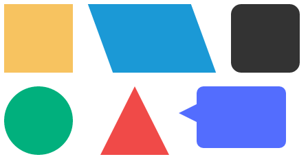
Table of Content
Square & Retangle
Square and Retangle are the easies shape you can draw with CSS, as they are the natural shapes of the web.
Square

.square {
  width: 200px;
  height: 200px;
  background-color: orchid;
}
Retangle

.retangle {
  width: 200px;
  height: 100px;
  background-color: mediumpurple;
}
Triangles
border property
Before drawing the triangle, let’s take a look at the property of border in the box model.
(If you are not familiar with CSS Box Model, you can click here).

.box {
  width: 200px;
  height: 200px;

  border-top: 10px solid lightgreen;
  border-right: 10px solid mediumpurple;
  border-bottom: 10px solid lightsalmon;
  border-left: 10px solid moccasin;
}
.content{
  width: 100%;
  height: 100%;
  font-size: 50px;
  background-color: skyblue;
  text-align: center;
  line-height: 200px;
}
You can see that see that the borders of equal width butt up against each other at 45 degree angles.
Implement
Let remove the content box(blue area) and increase all border widths.
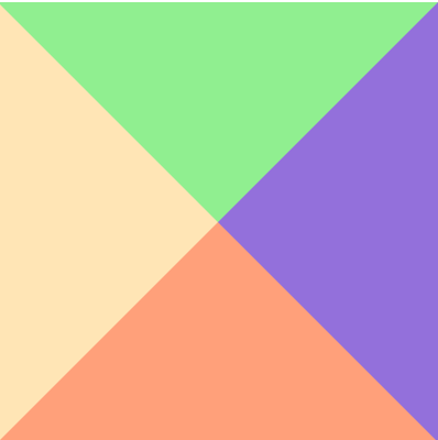
.box {
  width: 0;
  height: 0;

  border-top: 100px solid lightgreen;
  border-right: 100px solid mediumpurple;
  border-bottom: 100px solid lightsalmon;
  border-left: 100px solid moccasin;
}
As a result, we got 4 triangles.
Just set the other border colours transparent:
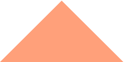
.box {
  width: 0;
  height: 0;

  border-top: 100px solid transparent;
  border-left: 100px solid transparent;
  border-right: 100px solid transparent;
  border-bottom: 100px solid lightsalmon;
}
More about triangle
We can “rotate” triangle by setting which border is non-transparent.
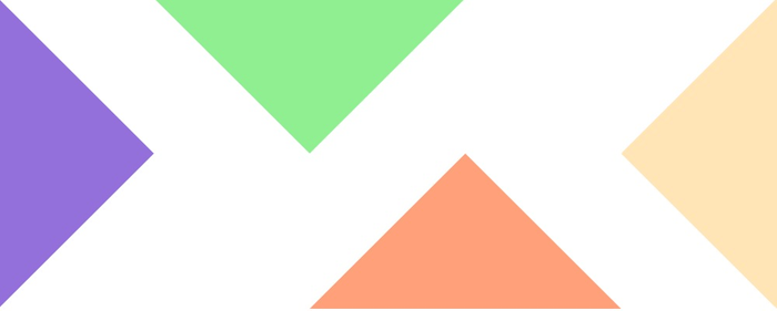
.triangle1 {
  width: 0;
  height: 0;

  border-top: 100px solid transparent;
  border-left: 100px solid mediumpurple;
  border-right: 100px solid transparent;
  border-bottom: 100px solid transparent;
}

.triangle2 {
  width: 0px;
  height: 0px;

  border-top: 100px solid lightgreen;
  border-left: 100px solid transparent;
  border-right: 100px solid transparent;
  border-bottom: 100px solid transparent;
}

.triangle3 {
  width: 0;
  height: 0;

  border-top: 100px solid transparent;
  border-left: 100px solid transparent;
  border-right: 100px solid transparent;
  border-bottom: 100px solid lightsalmon;
}

.triangle4 {
  width: 0;
  height: 0;

  border-top: 100px solid transparent;
  border-left: 100px solid transparent;
  border-right: 100px solid moccasin;
  border-bottom: 100px solid transparent;
}
Trapezoid
What happen if we add width value for the border-only box above?
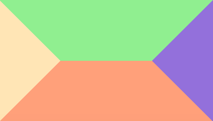
.box{
  width: 150px;
  height: 0px;

  border-top: 100px solid lightgreen;
  border-left: 100px solid moccasin;
  border-right: 100px solid mediumpurple;
  border-bottom: 100px solid lightsalmon;
}
Awesome, we got 4 trapezoids! Like the triangles, we cang get a single trapezoid by hiding 3 borders.

.trapezoid{
  width: 150px;
  height: 0px;

  border-top: 100px transparent;
  border-left: 100px solid transparent;
  border-right: 100px solid transparent;
  border-bottom: 100px solid lightsalmon;
}
Circle
border-radius
Before we jump to circle, let’s see first how border-radius works?
Like many CSS properties relating to margins, padding and borders, there are four individual properties - one for each corner of a box element - and one shorthand property.
border-to-right-radius
border-bottom-right-radius
border-bottom-left-radius
border-top-left-radius
border-radius
The border-radius properties can each accept either one or two values, expressed as a length or a percentage (percentages refer to the corresponding dimensions of the border box).
border-*-radius: [ <length> | <%> ] [ <length> | <%> ]?The following diagram gives a few examples of how corners might appear given differing radius:

Implement
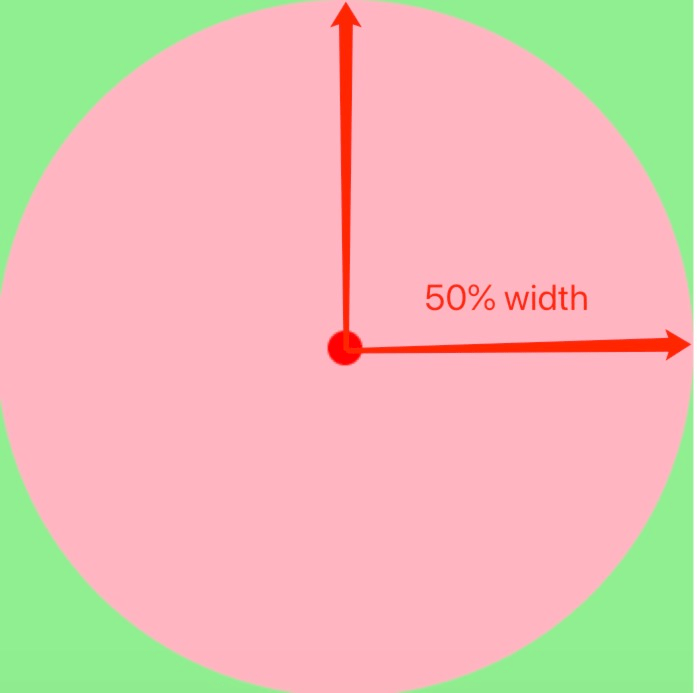
If we set border-radius: 50% (50% can be (width/2)px) in a squre, we can get a circle.
Oval
Circle is generated from square, oval is generated from retangle.
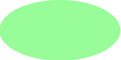
.oval {
  width: 200px;
  height: 100px;
  border-radius: 50%;
  background-color: paleGreen;
}
Quadrant
Drawing a quadrant is easy if you learned how to draw a circle, just set the value of border-radius from 50% to 100%.
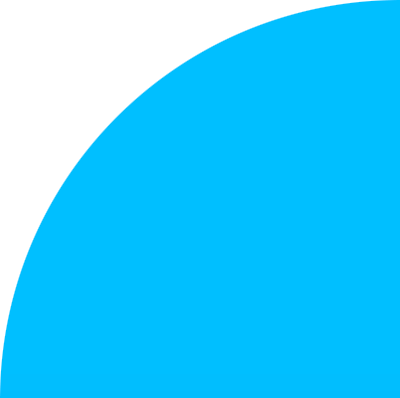
.quadrant{
 background-color: deepSkyBlue;
 width: 200px;
 height: 200px;
 border-radius: 100% 0 0 0;
}
Same as triangle, you can set border-radius value to “rotate” the quadrant.
Cone
Cone can be draw with the trangle and circle technique.
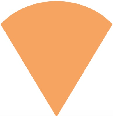
.cone {
  width: 0;
  height: 0;
  border-left: 150px solid transparent;
  border-right: 150px solid transparent;
  border-top: 200px solid sandybrown;
  border-radius: 50%;
}
Summary
You can find all implementation on my codepen.
Now it’s your turn to make your own icon shape with css.

![React [w]orkshop: React Component Lifecycle with Examples](https://github.com/lokissue/luomingzhang.com/blob/master/static/media/react-post/react-logo.png?raw=true)